A website or app is like the human body

A website or app is like the human body

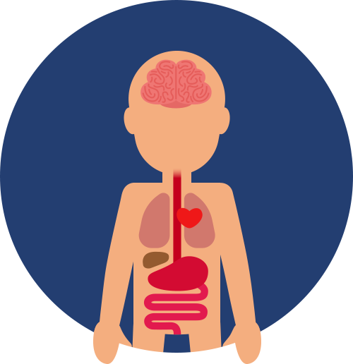
CODE = skeleton
A website or app is like the human body

UX = organs

A website or app is like the human body

UI = appearance

skeleton

Without solid bones, the whole body collapes and you can't use it
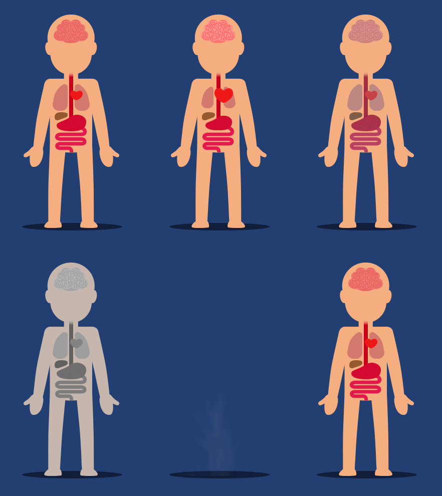
organs

Without organs, the body can't function and it will die

appearance

Without a pleasant appearance, you will repulse or frighten others

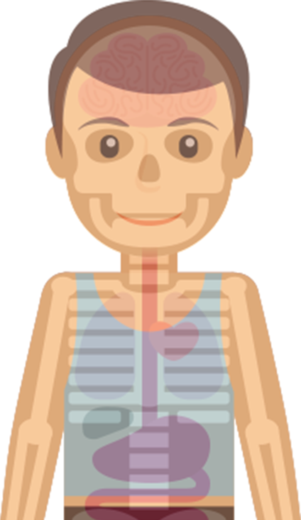
„The combination of solid bones (code), healthy organs (UX) and a pleasant appearance (UI), creates a functional, meaningful and aesthetic organic machine (website or app).“
A website or app is like the human body
Good code
A website or app is like the human body
In a well-coded responsive website, everything is in its place.
Bad code
A website or app is like the human body
In a poor responsive website, the elements are scattered.
Good UX
A website or app is like the human body
A good UX is easy to navigate. You won't be confused by lots of useless information.
Bad UX
A website or app is like the human body
A bad UX will rob you of the time it takes to understand the website or product. A user might give up the fight.
Good UI
A website or app is like the human body
When you click a button, you know that something happened. You always get feedback.
Bad UI
A website or app is like the human body
Here you have no certainty. Were you redirected to another page? Did something happen?

"UI without UX is like a body without a soul."

A website or app is like the human body

"UI without UX is like a body without a soul."

Why pay for a premium UX and UI?

Why pay for a premium UX and UI?

Surely you don't expect quality without any chemicals from a low-priced juice. The same applies to well-made products and services. Will you choose cheap substitutes or the real deal?